


Colour has always been something I have struggled with. I have made so many colour stories, looked at trends, linked my colour to what my customer would want and looked at available fabrics I can get in what colour.


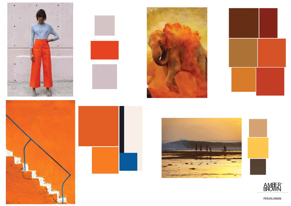
These were the trends that originally caught my eye. I have a bit of an obsession with orange as it is a really happy, warming colour so wanted my entire collection to be orange. However, orange isn't really sophisticated contradicting my customers taste.
I moved on to looking at images of travel and style to see the colour proportion and what made them work to what didn't.
October 22nd
November 17th
November 24th
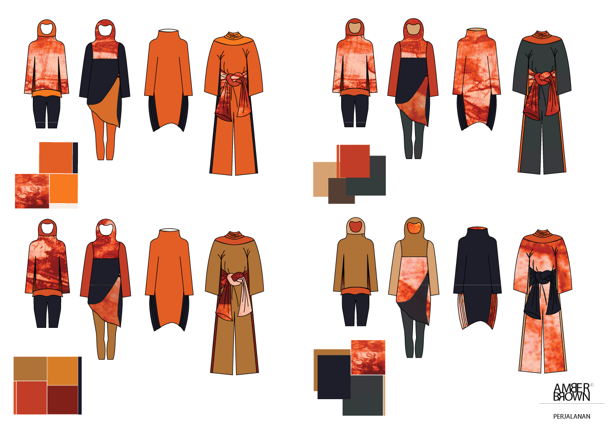

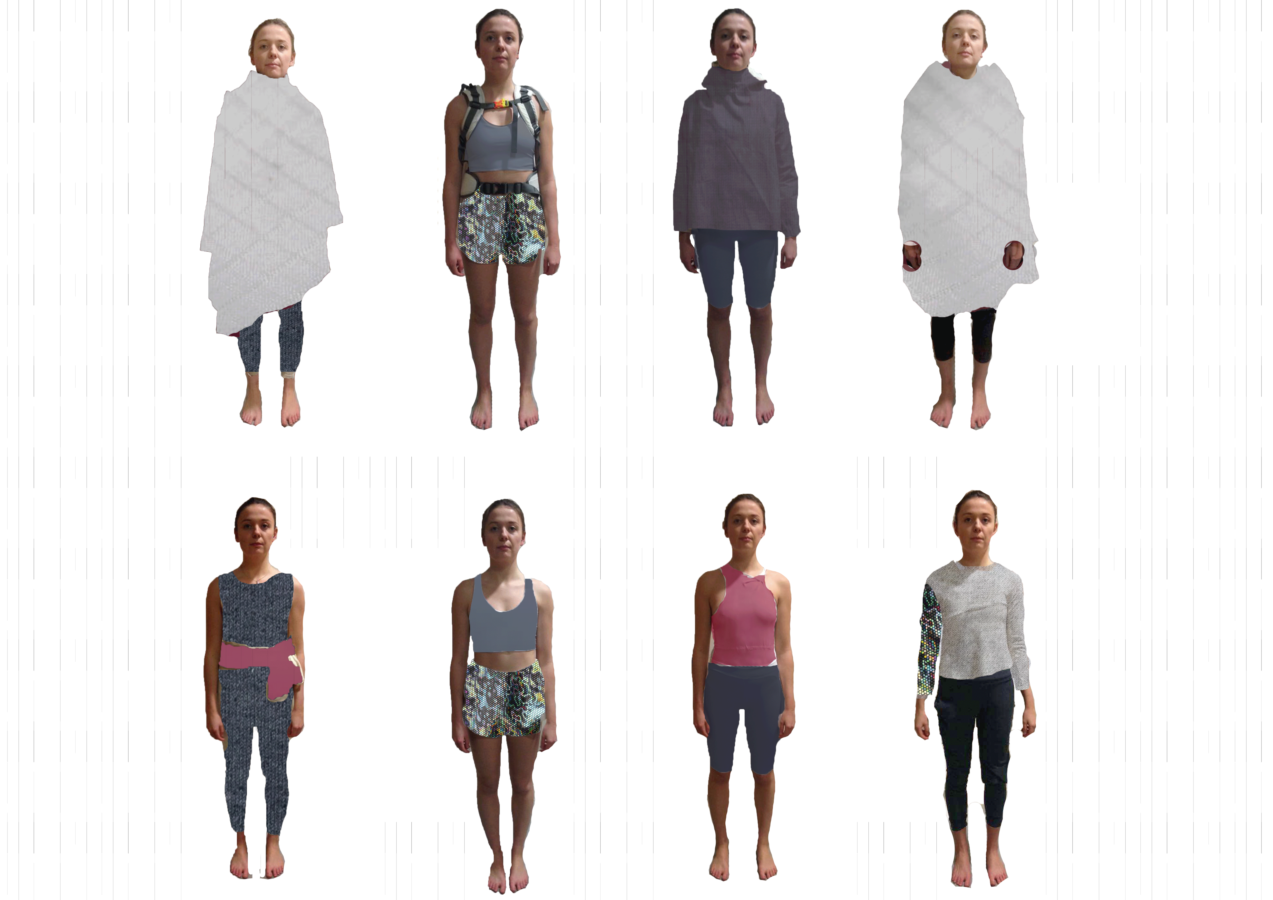
I used these colour compositions to experiment with on my final cad line up. I think the difficulty is what looks good on paper may not look good on an actual garment. I was still struggling.


I tried so many different combinations but then I came to the conclusion that they are all too garish for my customer so decided to go back to the drawing board.
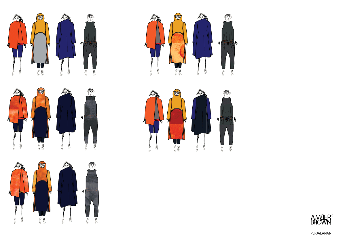
I looked at The Row and what makes their garments so classy and timeless. They have big unusual silouhettes like I do but understated colour. The Row have taught me that less can be more
November 24th- January 4th
January 4th


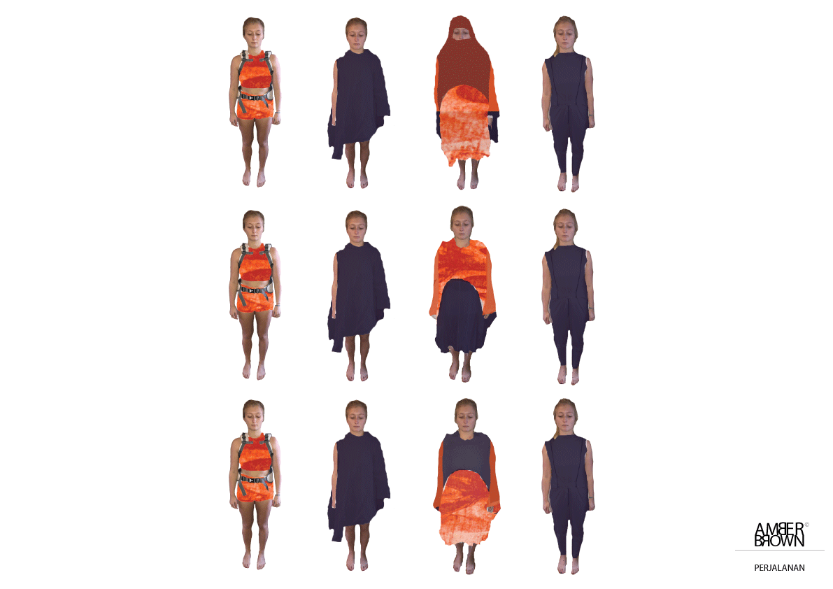
I went back to orange and my original print to see if I could make it look elegant and classy on my first final toile line up. I came to the conclusion that I really did need to step away from the orange all together.
January 11th
After looking at fabrics certain colours and fabrics instantly caught my eye and stood out for me. I took snippets of these fabrics or colours to see where this wouls lead me. Already my collection appeared to fit my target market 1000 times more than before.
January 18th
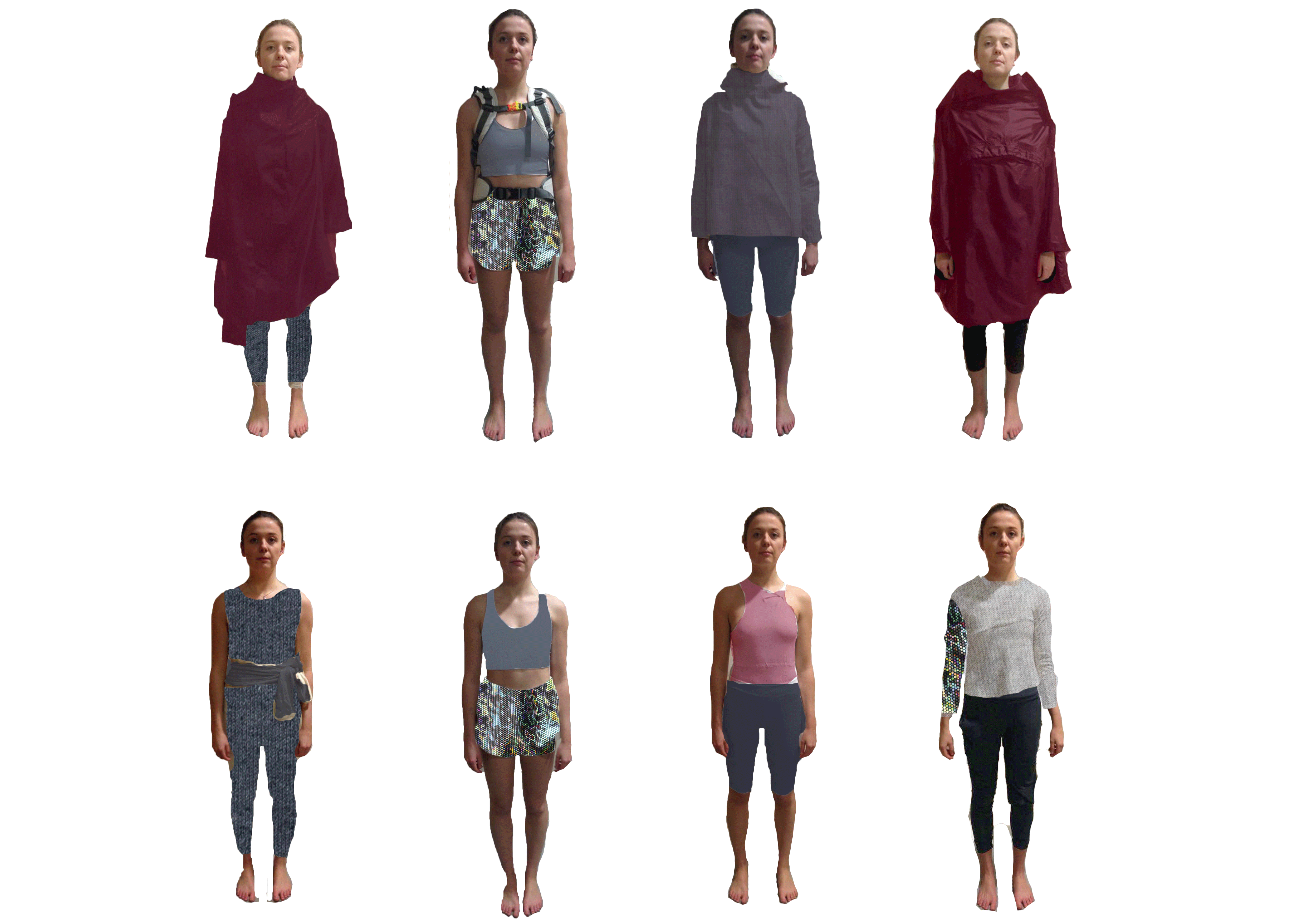
I looked online to see what ripstop colours are available to buy that are waterproof and this burgundy jumped out at me. I think this is the statement colour my collection was missing. In this colour line up though, I think that the baby pink does not do it justice.

Making colour proportions of all of the colours from these collections I like the best and what was missing ( deep blue) helped me move forwards once more, like a selection process.
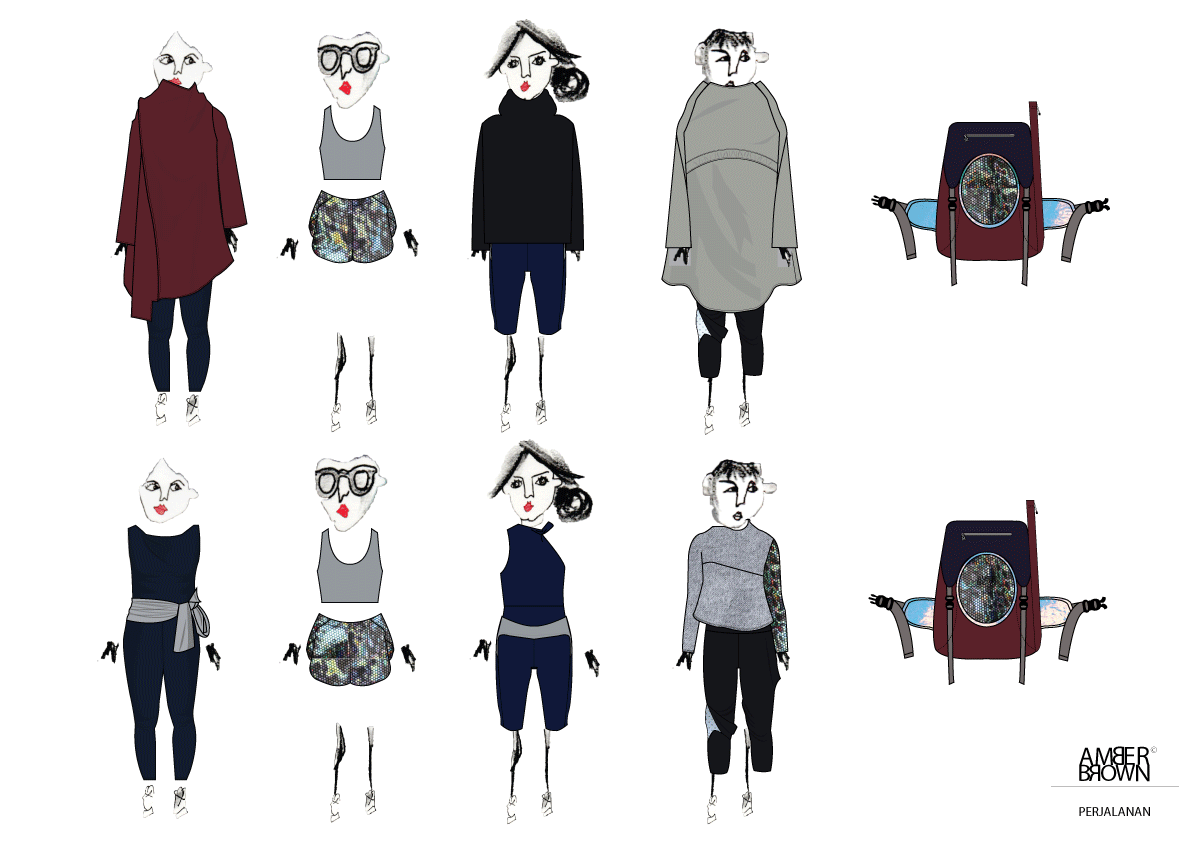
I think my final line up has the understated colours needed to blend in whilst travelling but has kept the sophistication and class my client would love and be able to wear on a daily basis too.